单细胞 芯片 转录组测序的数据挖掘文章一比一复现
自己造轮子

(生信技能树优秀学员“细心的网友”)

马拉松授课线上直播课程,最近的一期是5月8号(今晚七点半)开课哦:
生信入门&数据挖掘线上直播课5月班
文章复现:Integration of Single-Cell RNA Sequencing and Bulk RNA Sequencing Data to Establish and Validate a Prognostic Model for Patients With Lung Adenocarcinoma
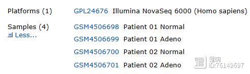
全文数据分析,没有湿实验。在GEO数据库下载了一份scRNA的数据,两份基因芯片的数据,还下载了TCGA的数据。研究肺腺癌(LUAD),整合scRNA-seq和传统的RNA-seq数据来构建LUAD患者的预后模型,并采用两个外部验证队列来验证其风险分层能力。
文章整体思路如下:
单细胞降维分群注释,找出tumor和normal间关键细胞类型。单细胞功能富集,拟时序分析,细胞通讯分析TCGA数据进行差异分析,GO,KEGG功能富集TCGA数据进行WGCNA分析,找到hub gene后,取hub gene和TCGA DEGs的交集,进行后续分析单因素Cox回归鉴定潜在的预后DEGs,非负矩阵分解进行sample clustering(亚型),不同cluster的生存分析,免疫浸润分析单因素Cox回归筛选出的gene用LASSO模型进一步筛选,筛选完后进行多因素Cox回归,计算每个样本的risk score,根据risk score分成两类,进行生存分析,将构建的模型应用于两个GEO芯片数据,进行同样分析高危低危人群与临床信息相关性分析,分析risk score是否可作为预后指标,基因突变分析ssGSEA分析,免疫检查点与肿瘤突变负荷分析
本次复现只是为了复现图表,数据不一定具有生物学意义(大家可以理解为凑图或者灌水)
Step 1.单细胞数据处理
先下载好数据,一共4个样本就新建4个文件夹,名字命名成样本名,文件夹内带'GSM'开头的数据是下载的原始数据,重新复制一份,把文件名改成标准的read10x函数读入格式,一定注意名字不要写错。

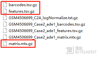
一定要保证这3个文件同时存在,而且在同一个文件夹下面。
示例代码是:
rm(list=ls())options(stringsAsFactors = F)library(Seurat)sce1 <- CreateSeuratObject(Read10X('../10x-results/WT/'), "wt")
重点就是 Read10X 函数读取 文件夹路径,比如:../10x-results/WT/ ,保证文件夹下面有3个文件。
1.1 QC
library(Seurat)library(harmony)
library(dplyr)
library(stringr)
rm(list = ls())
# 多个数据读取与合并
rawdata_path <- './rawdata'
filename <- list.files(rawdata_path)
rawdata_path <- paste(rawdata_path,filename,sep = '/')
sceList <- lapply(rawdata_path, function(x){
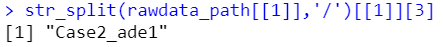
obj <- CreateSeuratObject(counts = Read10X(x),
project = str_split(x,'/')[[1]][3])
})
names(sceList) <- filename
这里sceList是一个列表,列表里共4个元素,每个元素都是一个seurat对象,每个元素的名字就是上面的样本名。rawdata_path就是上面下载的.gz文件 所在文件夹的路径,Read10X函数只需要传入文件夹路径就可以自动读入数。

project参数传入的是一个字符串,一般用样本名即可,这里用str_split函数分割路径字符串得到样本名
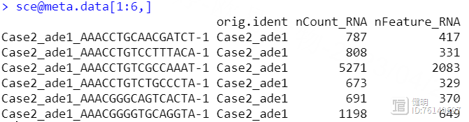
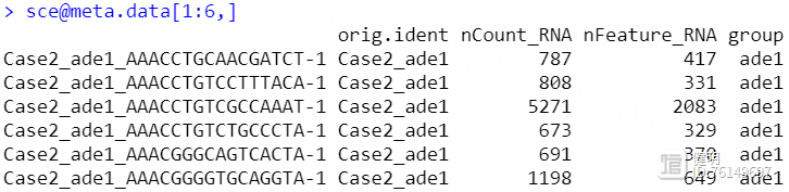
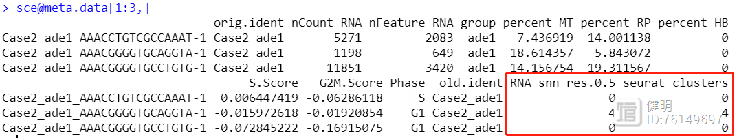
sce <- merge(sceList[[1]],sceList[-1],add.cell.ids = names(sceList),project = 'luad')
sce@meta.data$group <- str_split(sce@meta.data$orig.ident,'_',simplify = T)[,2]
把4个seurat对象用merge函数合并后,看一下每个细胞的基本信息,这里我根据作者给出的信息,把疾病和正常分成两组,又增加了一列,ade1是疾病,nor是正常
# 查看线粒体(MT开头)、核糖体(RPS/RPL开头)、血红细胞所占比例
grep('^MT',x=rownames(sce@assays$RNA@data),value = T)
grep('^RP[SL]',x=rownames(sce@assays$RNA@data),value = T)
grep('^HB[^(P)]',x=rownames(sce@assays$RNA@data),value = T)
sce <- PercentageFeatureSet(sce,'^MT',col.name = 'percent_MT')
sce <- PercentageFeatureSet(sce,'^RP[SL]',col.name = 'percent_RP')
sce <- PercentageFeatureSet(sce,'^HB[^(P)]',col.name = 'percent_HB')
VlnPlot(sce,features = "nCount_RNA",pt.size = 0,y.max = 10000)
VlnPlot(sce,features = "nFeature_RNA",pt.size = 0,y.max = 2500)
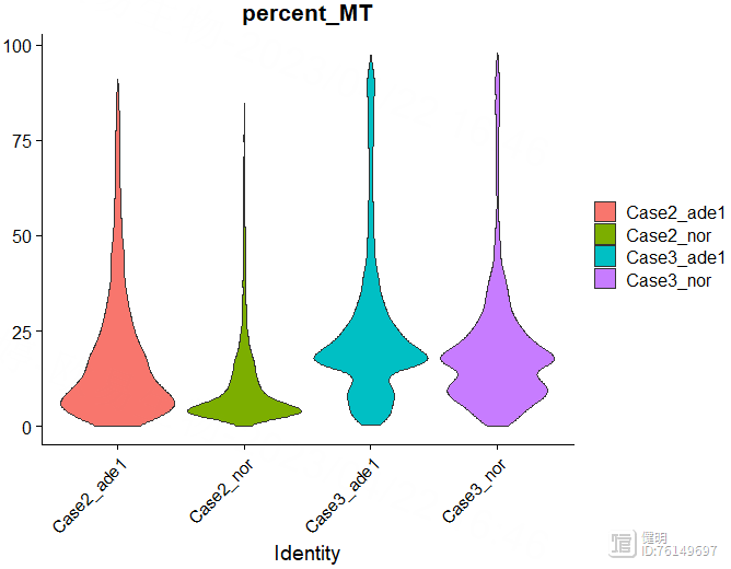
VlnPlot(sce,features = "percent_MT",pt.size = 0)
VlnPlot(sce,features = "percent_RP",pt.size = 0)
VlnPlot(sce,features = "percent_HB",pt.size = 0,y.max = 0.1)
VlnPlot(sce,features = c("nCount_RNA","nFeature_RNA","percent_MT"),pt.size = 0,group.by = 'orig.ident')
对于每个细胞,我又添加了三列信息:线粒体基因占比,核糖体基因占比,红细胞基因占比。这几列用来过滤数据,这里重新给sce赋值是因为,PercentageFeatureSet函数的返回值还是一个seurat对象,和原来的sce相比, 就只是在meta data里多了一列而已,所以直接重新赋值,把原来的seurat对象sce给更新掉


过滤前先看下数据,32538个gene,13060个细胞

# 过滤细胞
sce <- subset(sce,subset = nCount_RNA>1000 & nFeature_RNA>300 & percent_MT<25)
# 过滤基因
sce <- sce[rowSums(sce@assays$RNA@counts>0)>3,]
# 过滤线粒体、核糖体、血红细胞进占比高的细胞
sce <- subset(sce,subset = percent_MT<25 & percent_RP<30 & percent_HB<0.1)
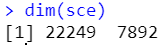
过滤完后22249个gene,7892个细胞
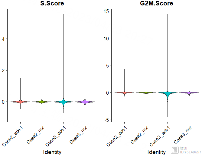
# 细胞周期评分
# S.Score较高的为S期,G2M.Score较高的为G2M期,都比较低的为G1期
s_feature <- cc.genes.updated.2019$s.genes
g2m_feature <- cc.genes.updated.2019$g2m.genes
sce <- CellCycleScoring(sce,
s.features = s_feature,
g2m.features = g2m_feature,
set.ident = T)
VlnPlot(sce,features = c('S.Score','G2M.Score'),group.by = 'orig.ident',pt.size = 0)
saveRDS(sce,'sce_qc.rds')
再看一下细胞周期,把细胞周期两个评分加到meta data里,更新sce
1.2 用harmony去除批次效应
library(harmony)library(dplyr)
library(Seurat)
library(clustree)
rm(list = ls())
sce <- readRDS('sce_qc.rds')
sce <- NormalizeData(sce,
normalization.method = 'LogNormalize',
scale.factor = 10000)
sce <- FindVariableFeatures(sce,
selection.method = "vst",
nfeatures = 2000)
# 默认用variableFeature做scale
sce <- ScaleData(sce)
sce <- RunPCA(sce,features = VariableFeatures(sce))
DimPlot(sce,reduction = 'pca',group.by = 'group')
从PCA降维的结果看,两个组的批次效应不大,均匀的混合在一起,但是这里还是用harmony试试

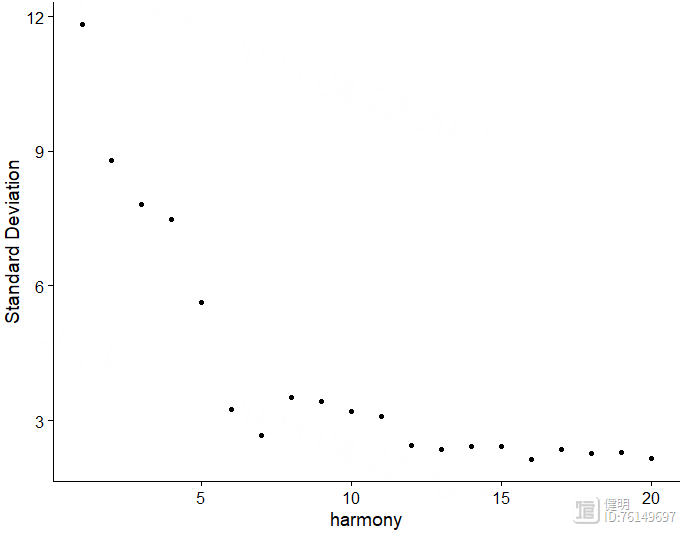
sce <- RunHarmony(sce,group.by.vars = 'orig.ident')
ElbowPlot(sce,reduction = 'harmony')
sce <- RunUMAP(sce,dims = 1:10,reduction = 'harmony')
sce <- RunTSNE(sce,dims = 1:10,reduction = 'harmony')
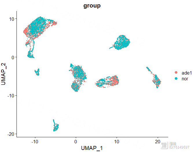
DimPlot(sce,reduction = 'umap',label = T,group.by = 'group')
DimPlot(sce,reduction = 'tsne',label = T,group.by = 'group')
选择orig.ident这一列,去除4个样本之间的批次效应。根据肘部图确定降维后的维度。
sce <- FindNeighbors(sce,reduction = 'harmony',dims = 1:10)
sce_res <- FindClusters(sce_res,resolution = 0.8)
# 设置不同的分辨率查看分组情况
sce_res <- sce
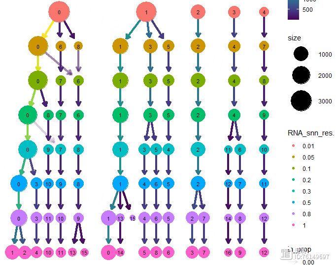
for (i in c(0.01, 0.05, 0.1, 0.2, 0.3, 0.5,0.8,1)){
sce_res <- FindClusters(sce_res,resolution = i)
}
clustree(sce_res,prefix = 'RNA_snn_res.')
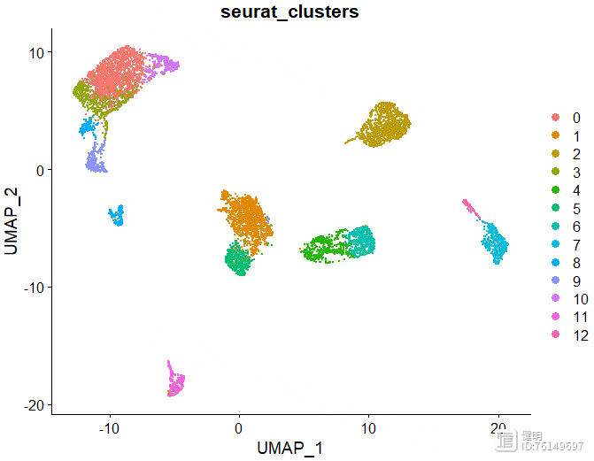
FindNeighbors函数计算细胞间的距离,FindClusters函数确定分群结果。上面的UMAP看着大概分了7坨,但实际上并不是7个分群,实际分群数量还是要看FindClusters的结果。FindClusters函数分辨率不同,分群数量会不同,具体分多少需要摸索。这里分辨率选了0.5,对应第六行蓝色,13个分群,如果选0.8的话,感觉分群数量会突然增加好多,不太合适。
sce <- FindClusters(sce,resolution = 0.5)
saveRDS(sce,file = 'step2_harmony.rds')
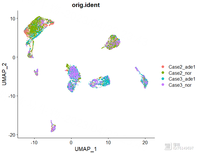
DimPlot(sce,reduction = 'umap',group.by = 'orig.ident')
DimPlot(sce,reduction = 'umap',group.by = 'seurat_clusters')
确定好分辨率后,分群赋值给sce,在meta data里会多出来两列,这两列是一样的,表示每个细胞分在哪个cluster里,最后保存一下更新后的sce对象,再来看下分群结果
1.3 细胞注释
library(SingleR)library(celldex)
library(Seurat)
library(dplyr)
library(stringr)
library(pheatmap)
library(ReactomeGSA)
library(monocle)
library(limma)
library(ggplot2)
library(msigdbr)
library(singleseqgset)
rm(list = ls())
gc()
sce <- readRDS('step2_harmony.rds')
# singleR注释
hpca.se <- HumanPrimaryCellAtlasData()
bpe.se <- BlueprintEncodeData()
anno <- SingleR(sce@assays$RNA@data,
ref = list(BP=bpe.se,HPCA=hpca.se),
labels = list(bpe.se$label.main,hpca.se$label.main),
clusters = sce@meta.data$seurat_clusters
)
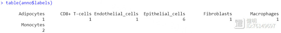
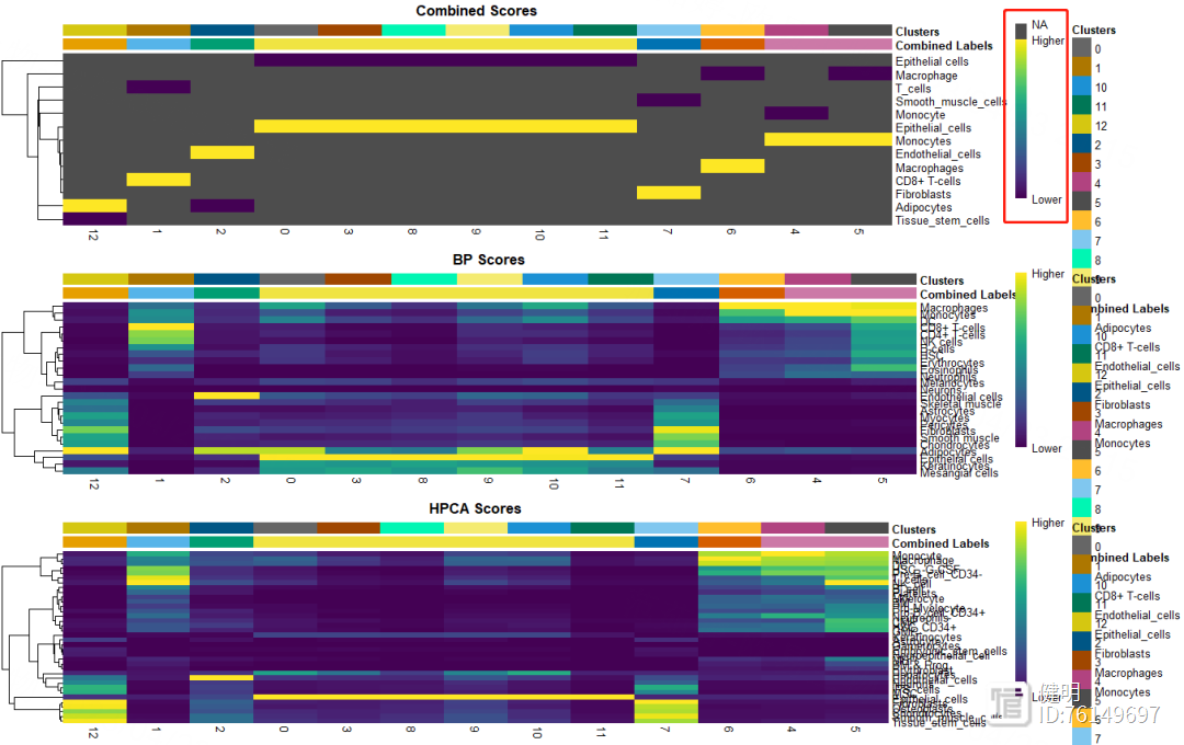
用SingleR自动注释,HumanPrimaryCellAtlasData和BlueprintEncodeData是SingleR自带的两个数据库,用两个数据库注释效果好像比一个会好点。得到的anno也是一个对象,每个细胞群的注释信息就藏在里面,13个分群被注释成7种细胞,其中有6个分群都是上皮细胞,也许上皮细胞还能继续细分。想继续细分的话,对sce取子集,把标签为上皮细胞的细胞取出来,降维分群,丢到SingleR()函数里再注释
plotScoreHeatmap(anno,clusters = anno@rownames,show_colnames = T)
再看下注释结果的打分,不满意的话也可以手动注释
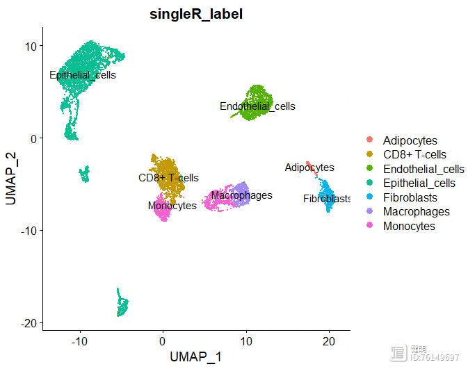
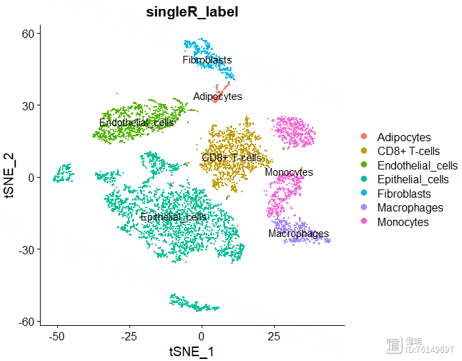
sce@meta.data$singleR_label <- unlist(lapply(sce@meta.data$seurat_clusters, function(x){anno$labels[x]}))
DimPlot(sce,reduction = 'umap',group.by = 'singleR_label',label = T)
DimPlot(sce,reduction = 'tsne',group.by = 'singleR_label',label = T)


anno里面有每个分群对应的注释信息,把这个信息添加到sce的meta data里,然后就可以在分群的图上添加上注释信息了
1.4 鉴定关键细胞类型
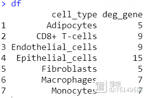
cell_list <- split(colnames(sce), sce$singleR_label)deg <- c()
for (i in names(cell_list)){
sce_temp <- sce[,colnames(sce) %in% cell_list[[i]]]
sce_temp <- CreateSeuratObject(counts = sce_temp@assays$RNA@counts,
meta.data = sce_temp@meta.data,
min.cells = 3,
min.features = 200)
sce_temp <- NormalizeData(sce_temp)
sce_temp <- FindVariableFeatures(sce_temp)
sce_temp <- ScaleData(sce_temp,vars.to.regress = c('nFeature_RNA','"percent_MT"'))
Idents(sce_temp) <- sce_temp$group
sce_temp_markers <- FindAllMarkers(object=sce_temp,
only.pos = T,
logfc.threshold = 2,
min.pct = 0.1)
sce_temp_markers <- sce_temp_markers[order(sce_temp_markers$cluster,sce_temp_markers$avg_log2FC),]
deg_gene <- sce_temp_markers[sce_temp_markers$p_val_adj<0.05,'gene']
deg <- c(deg,length(deg_gene))
}
df <- data.frame(cell_type = names(cell_list),deg_gene = deg)
把每种类型的细胞分别拿出来,用FindAllMarkers找出ade1和nor组之间的差异基因
1.5 单细胞通路富集
temp <- sceIdents(temp) <- temp@meta.data$singleR_label
reactome_obj <- analyse_sc_clusters(temp,create_reactome_visualization=T,use_interactors=F)
path_ways <- pathways(reactome_obj)
path_ways$diff <- rowMax(as.matrix(path_ways[,2:ncol(path_ways)])) - rowMin(as.matrix(path_ways[,2:ncol(path_ways)]))
path_ways <- path_ways[order(path_ways$diff,decreasing = T),]
plot_gsva_heatmap(reactome_obj,rownames(path_ways)[1:10],margins = c(10,20))
saveRDS(sce,file = 'step3_sce.rds')
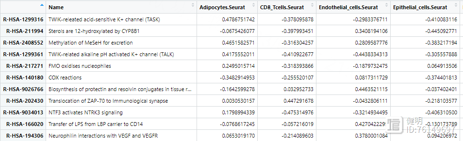
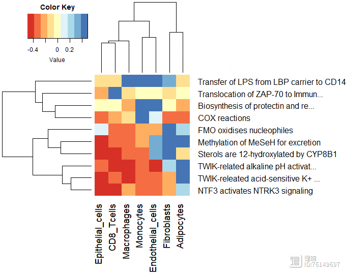
用pathway()提取富集出来的结果,每行是一个通路,每列是一种细胞,计算每个通路在7种细胞中表达差异的diff,根据diff排序,画出前10个通路
1.6 拟时序分析
library(Seurat)library(monocle)
sce <- readRDS('step3_sce.rds')
# 1. 将seurat对象转化为monocle的CDS对象
sparse_data <- as(as.matrix(sce@assays$RNA@counts),'sparseMatrix')
mdata <- new('AnnotatedDataFrame',data=sce@meta.data) # 行为cell
fData <- data.frame(gene_short_name=row.names(sparse_data),row.names = row.names(sparse_data))
fd <- new('AnnotatedDataFrame',data=fData) # 行为gene 列为gene description
monocle_cds <- newCellDataSet(cellData = sparse_data,
phenoData = mdata,
featureData = fd,
lowerDetectionLimit = 0.5,
expressionFamily = negbinomial.size())
# 2. 计算size factor和离散度
monocle_cds <- estimateSizeFactors(monocle_cds)
monocle_cds <- estimateDispersions(monocle_cds)
# 3.过滤低质量细胞
monocle_cds <- detectGenes(monocle_cds,min_expr = 0.1)
# 4. 找高变基因、降维分群
# 用seurat找的高变基因
sce_var_gene <- VariableFeatures(sce)
monocle_cds <- setOrderingFilter(monocle_cds,sce_var_gene)
monocle_cds <- reduceDimension(monocle_cds,num_dim=10,norm_method = 'log',reduction_method = 'tSNE')
monocle_cds <- clusterCells(monocle_cds,num_clusters = 10)
plot_cell_clusters(monocle_cds,color_by = 'singleR_label')
diff_test_gene <- differentialGeneTest(monocle_cds[sce_var_gene,],fullModelFormulaStr = '~singleR_label')
diff_gene <- row.names(subset(diff_test_gene,qval<0.01))
monocle_cds <- setOrderingFilter(monocle_cds,diff_gene)
# 5. 用reversed graph embedding降维
monocle_cds <- reduceDimension(monocle_cds,reduction_method = 'DDRTree')
# 6. 计算细胞拟时间
monocle_cds <- orderCells(monocle_cds)
这里运行到第六步,orderCells()函数大概率会报错,详细的解决办法可以参考知乎上的贴子https://zhuanlan.zhihu.com/p/589134519 ,这里说一下大概解决步骤
下载一个包,'igraph’下载一个R文件,order_cells.R,链接在知乎贴子里,然后source调用把orderCells()中用DDRTree计算的那部分代码单独拿出来,写成一个函数,后面直接调用,记得给出返回值。或者不封装成函数的形式也行,那就不需要返回值了# 6. 计算细胞拟时间
source('order_cells.R')
library('igraph')
my_ordercell <- function(cds){
root_state = NULL
num_paths = NULL
reverse = NULL
root_cell <- select_root_cell(cds, root_state, reverse)
cds@auxOrderingData <- new.env(hash = TRUE)
if (cds@dim_reduce_type == "DDRTree") {
if (is.null(num_paths) == FALSE) {
message("Warning: num_paths only valid for method 'ICA' in reduceDimension()")
}
cc_ordering <- extract_ddrtree_ordering(cds, root_cell)
pData(cds)$Pseudotime <- cc_ordering[row.names(pData(cds)), ]$pseudo_time
K_old <- reducedDimK(cds)
old_dp <- cellPairwiseDistances(cds)
old_mst <- minSpanningTree(cds)
old_A <- reducedDimA(cds)
old_W <- reducedDimW(cds)
cds <- project2MST(cds, project_point_to_line_segment)
minSpanningTree(cds) <- cds@auxOrderingData[[cds@dim_reduce_type]]$pr_graph_cell_proj_tree
root_cell_idx <- which(V(old_mst)$name == root_cell, arr.ind = T)
cells_mapped_to_graph_root <- which(cds@auxOrderingData[["DDRTree"]]$pr_graph_cell_proj_closest_vertex == root_cell_idx)
if (length(cells_mapped_to_graph_root) == 0) {
cells_mapped_to_graph_root <- root_cell_idx
}
cells_mapped_to_graph_root <- V(minSpanningTree(cds))[cells_mapped_to_graph_root]$name
tip_leaves <- names(which(degree(minSpanningTree(cds)) == 1))
root_cell <- cells_mapped_to_graph_root[cells_mapped_to_graph_root %in% tip_leaves][1]
if (is.na(root_cell)) {
root_cell <- select_root_cell(cds, root_state, reverse)
}
cds@auxOrderingData[[cds@dim_reduce_type]]$root_cell <- root_cell
cc_ordering_new_pseudotime <- extract_ddrtree_ordering(cds, root_cell)
pData(cds)$Pseudotime <- cc_ordering_new_pseudotime[row.names(pData(cds)), ]$pseudo_time
if (is.null(root_state) == TRUE) {
closest_vertex <- cds@auxOrderingData[["DDRTree"]]$pr_graph_cell_proj_closest_vertex
pData(cds)$State <- cc_ordering[closest_vertex[, 1], ]$cell_state
}
}
cds
}
monocle_cds <- my_ordercell(monocle_cds)
# 可以画图了
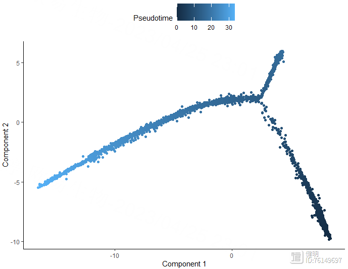
plot_cell_trajectory(monocle_cds,color_by = 'Pseudotime')
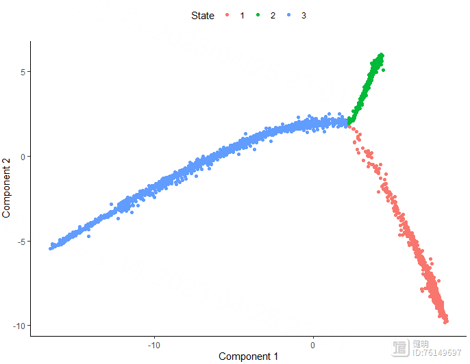
plot_cell_trajectory(monocle_cds,color_by = 'State')
plot_cell_trajectory(monocle_cds,color_by = 'singleR_label')
plot_cell_trajectory(monocle_cds,color_by = 'singleR_label') facet_wrap(~singleR_label,nrow = 3)
saveRDS(monocle_cds,file = 'monocle.rds')
1.7 细胞通讯
library(CellChat)library(patchwork)
library(Seurat)
library(dplyr)
library(ggalluvial)
library(NMF)
options(stringsAsFactors = FALSE)
rm(list = ls())
gc()
sce <- readRDS('step3_sce.rds')
# Step1.创建cellchat对象
data.input <- sce@assays$RNA@data
meta.data <- sce@meta.data
cellchat <- createCellChat(object=data.input,
meta = meta.data,
group.by='singleR_label')
cellchat <- addMeta(cellchat,meta = meta.data)
# Step2.加载CellChatDB数据库
cellchatDB <- CellChatDB.human
cellchat@DB <- cellchatDB
# Step3.处理表达数据
cellchat <- subsetData(cellchat)
cellchat <- identifyOverExpressedGenes(cellchat)
cellchat <- identifyOverExpressedInteractions(cellchat)
# Step4.计算通讯概率,推断细胞通讯网络 这一步很耗时
cellchat <- computeCommunProb(cellchat,population.size = F)
cellchat <- filterCommunication(cellchat,min.cells = 10)
# Step5. 提取预测的细胞通讯网络为data frame
df.net <- subsetCommunication(cellchat)
df.pathway <- subsetCommunication(cellchat,slot.name = 'netP')
# Step6. 在信号通路水平推断细胞通讯
cellchat <- computeCommunProbPathway(cellchat)
# Step7. 计算加和的cell-cell通讯网络
cellchat <- aggregateNet(cellchat)
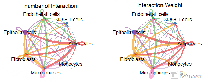
par(mfrow = c(1,2))
netVisual_circle(cellchat@net$count,vertex.weight = groupSize,
weight.scale = T,label.edge = F,
title.name = 'number of Interaction')
netVisual_circle(cellchat@net$weight,vertex.weight = groupSize,
weight.scale = T,label.edge = F,
title.name = 'Interaction Weight')
mat <- cellchat@net$weight
par(mfrow = c(3,3),xpd=T)
for (i in 1:nrow(mat)){
mat2 <- matrix(0,nrow = nrow(mat),ncol = ncol(mat),
dimnames = dimnames(mat))
mat2[i,] <- mat[i,]
netVisual_circle(mat2,vertex.weight = groupSize,
weight.scale = T,edge.weight.max = max(mat),
title.name = rownames(mat)[i])
}
# Step8. 使用层次图(Hierarchical plot),圆圈图(Circle plot)或和弦图(Chord diagram)可视化每个信号通路
cellchat@netP$pathways
pathway.show <- c('SEMA4')
vertex.receiver <- c(1,2,3,4)
netVisual_aggregate(cellchat,signaling = pathway.show,
vertex.receiver = vertex.receiver,
layout = 'hierarchy')
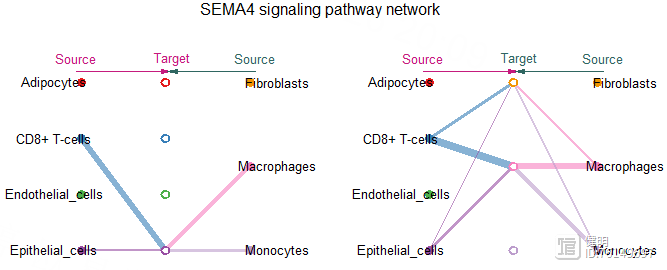
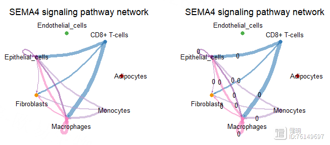
par(mfrow=c(1,2),xpd=T)
netVisual_aggregate(cellchat,signaling = pathway.show,
layout = 'circle')
netVisual_aggregate(cellchat,signaling = pathway.show,
layout = 'circle',label.edge=T)
pairLR.CXCL <- extractEnrichedLR(cellchat,signaling = pathway.show,
geneLR.return = F)
LR.show <- pairLR.CXCL[1,]
netVisual_individual(cellchat,signaling = pathway.show,
pairLR.use = 'SEMA4A_PLXNB2',
layout = 'circle')
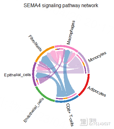
netVisual_aggregate(cellchat,signaling = pathway.show,layout = 'chord',
title.name = "Chord diagram 1")

Step 2. TCGA差异分析
library(TCGAbiolinks)library(SummarizedExperiment)
library(AnnoProbe)
library(stringr)
library(limma)
library(tinyarray)
library(data.table)
library(ggplot2)
library(dplyr)
library(tibble)
library(pheatmap)
library(clusterProfiler)
library(org.Hs.eg.db)
rm(list = ls())
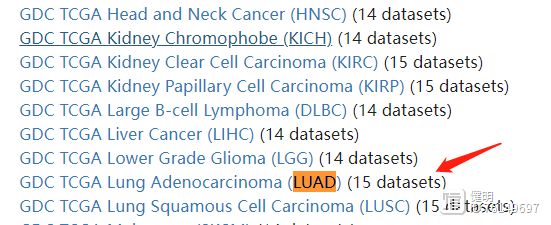
# 下载LUAD表达矩阵
query <- GDCquery(project = 'TCGA-LUAD',
data.category = 'Transcriptome Profiling',
data.type = 'Gene Expression Quantification',
workflow.type = 'STAR - Counts')
GDCdownload(query)
dat <- GDCprepare(query)
exp <- assay(dat)
save(exp,file='TCGA_LUAD_exp.Rdata')
# 下载LUAD临床信息
query <- GDCquery(project = 'TCGA-LUAD',
data.category = 'Clinical',
data.type = 'Clinical Supplement',
file.type = 'xml')
GDCdownload(query)
dat <- GDCprepare_clinic(query,clinical.info = 'patient')
k = apply(dat, 2, function(x){!all(is.na(x))});table(k)
clinical <- dat[,k]
save(clinical,file = 'TCGA_LUAD_Clinical.Rdata')
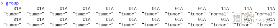
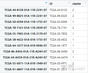
注意一下TCGA的样本命名含义:
以这个为例:TCGA-A6-6650-01A-11R-1774-07
A6:Tissue source site,组织来源编码
6650:Participant, 参与者编号
01:Sample, 编号01~09表示肿瘤,10~19表示正常对照
A:Vial, 在一系列患者组织中的顺序,绝大多数样本该位置编码都是A;
很少数的是B,表示福尔马林固定石蜡包埋组织,已被证明用于测序分析的效果不佳,所以不建议使用-01B的样本数据
11:Portion, 同属于一个患者组织的不同部分的顺序编号,同一组织会分割为100-120mg的部分,分别使用
R:RNA, 分析的分子类型,对应关系如下所示:
1774:Plate, 在一系列96孔板中的顺序,值大表示制板越晚
07:Center, 测序或鉴定中心编码
# count 转换成TPM
gene_length <- fread('gene_len.txt')
colnames(gene_length) <- c('id','length')
gene_length <- as.data.frame(gene_length)
gene_length <- gene_length[!duplicated(gene_length$id),]
exp <- as.data.frame(exp)
exp$id <- unlist(lapply(rownames(exp),function(x){str_split(x,'\\.',simplify = T)[,1]}))
merge <- left_join(x=exp,y=gene_length,by='id')
merge <- na.omit(merge)
merge <- merge[!duplicated(merge$id),]
rownames(merge) <- merge$id
merge <- merge[,-601]
# 计算TPM
kb <- merge$length / 1000
rpk <- merge[,-601] / kb
tpm <- t(t(rpk) / colSums(rpk) * 1E6)
exp <- tpm
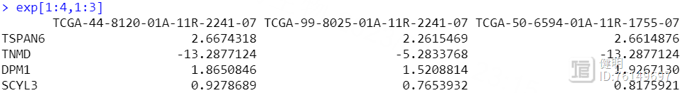
采用limma做差异分析,先把counts转换成TPM。不转也可以用DEseq2做差异分析。gene_length是每个基因的长度,这个文件是把gtf文件中,基因的终止位置-起始位置得到的。

# 更改行名:ENSEMBL -> SYMBOL
a <- annoGene(str_split(rownames(exp),'\\.',simplify = T)[,1],'ENSEMBL')
a <- a[!duplicated(a$ENSEMBL),]
rownames(a) <- a$ENSEMBL
rownames(exp) <- a[str_split(rownames(exp),'\\.',simplify = T)[,1],'SYMBOL']
# 给样本分组 tumor/normal
group <- ifelse(sapply(str_split(colnames(exp),'-',simplify = T)[,4],function(x){as.integer(substr(x,1,2))})>=10,
'normal','tumor')
sample_group <- data.frame(sample=colnames(exp),group=group)
a是annoGene函数返回的一个ID转换的结果,是一个dataframe,多个ENSEMBL ID可能对应同一个SYMBOL ID,对symbol去重后,再映射成exp的行名。

按照TCGA名字中第四部分,把样本分成tumor和normal

# 过滤
# 1. 去除FFPE样本
sample_group$sample_type <- ifelse(sapply(str_split(colnames(exp),'-',simplify = T)[,4],function(x){substr(x,3,3)})=='A',
'tissue','ffpe')
exp <- exp[,sample_group$sample_type!='ffpe']
sample_group <- sample_group[sample_group$sample_type=='tissue',]
# 2. 保留在一半以上样本中有值的gene
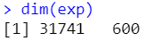
exp <- exp[rowSums(exp>0)>as.integer(ncol(exp)/2),]
dim(exp)
save(exp,file = 'TCGA_LUAD_TPM_exp.Rdata')
FFPE样本无论做测序还是蛋白组,代谢组,效果都不怎么好
# 对表达矩阵取log2
for (i in 1:ncol(exp)){
exp[,i] <- log2(exp[,i] 0.0001)
}
# 差异筛选
design <- model.matrix(~factor(sample_group$group,levels = c('tumor','normal')))
fit <- lmFit(exp,design = design)
fit <- eBayes(fit)
deg <- topTable(fit, coef = 2,number = Inf)
deg$change <- ifelse((deg$logFC>log2(2))&(deg$adj.P.Val<0.05),'up',
ifelse((deg$logFC<log2(0.5))&(deg$adj.P.Val<0.05),'down','nochange'))
deg <- na.omit(deg)
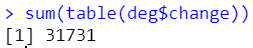
table(deg$change)
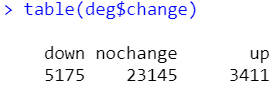
做完差异筛选,有10个gene含空值,删去有空值的行即可。更新下exp并保存好
# deg比exp少了几个gene
exp <- exp[intersect(rownames(exp),deg$ID),]
save(exp,file = 'TCGA_exp.Rdata')
save(deg,file = 'TCGA_DEGS.Rdata')
# volcano plot
ggplot(deg,aes(x=deg$logFC,y=-log10(deg$adj.P.Val),color=change))
geom_point()
geom_hline(yintercept = -log10(0.05),linetype=2,linewidth=1)
geom_vline(xintercept = log2(0.5),linetype=2,linewidth=1)
geom_vline(xintercept = log2(2),linetype=2,linewidth=1)
scale_color_manual(values=c('blue','gray','red'))
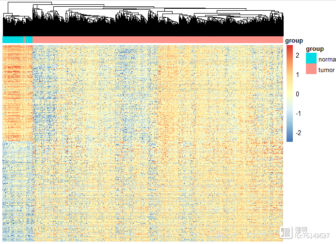
# heatmap
deg_heatmap <- deg[order(deg$logFC,decreasing = T),]
deg_gene <- deg_heatmap[deg_heatmap$change!='nochange','ID']
heatmap_deg_gene <- as.data.frame(exp)[deg_gene,]
heatmap_deg_gene <- na.omit(heatmap_deg_gene)
anno_col <- data.frame(group=sample_group$group)
rownames(anno_col) <- sample_group$sample
pheatmap(heatmap_deg_gene,show_rownames = F,cluster_rows = F,scale = 'row',
show_colnames = F,annotation_col=anno_col ,
breaks = seq(-2.5,2.5,length.out=100))
dim(heatmap_deg_gene)
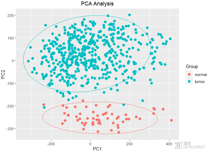
# pca plot
exp <- as.data.frame(exp)
pca <- prcomp(t(exp))
ggplot(data.frame(pca$x),aes(x=PC1,y=PC2,color=sample_group$group))
geom_point(size = 3) stat_ellipse(level = 0.95, show.legend = F)
labs(title = 'PCA Analysis')
theme(plot.title = element_text(hjust = 0.5))
guides(color = guide_legend(title = 'Group'))

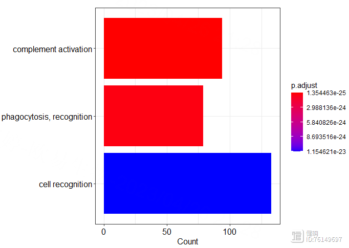
# GO enrich
go_bp <- enrichGO(deg_gene,org.Hs.eg.db,'SYMBOL','BP')
go_mf <- enrichGO(deg_gene,org.Hs.eg.db,'SYMBOL','MF')
go_cc <- enrichGO(deg_gene,org.Hs.eg.db,'SYMBOL','CC')
dotplot(go_bp)
barplot(go_bp,showCategory = 4)
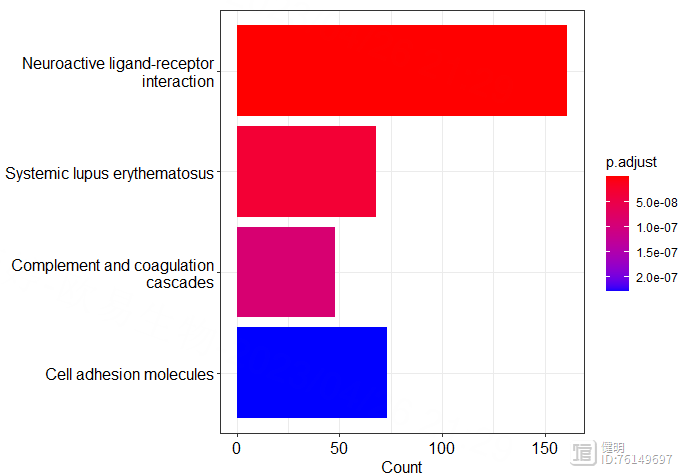
# KEGG enrich
entrez_id <- bitr(deg_gene,fromType = 'SYMBOL',toType = 'ENTREZID',OrgDb = org.Hs.eg.db)
kegg <- enrichKEGG(entrez_id$ENTREZID,organism = 'hsa',keyType = 'ncbi-geneid')
dotplot(kegg)
barplot(kegg,showCategory = 4)
Step 3. WGCNA分析
library(WGCNA)library(reshape2)
library(stringr)
library(dplyr)
library(patchwork)
library(ggplot2)
rm(list = ls())
gc()
load('TCGA_DEGS.Rdata')
load('TCGA_exp.Rdata')
load('TCGA_LUAD_Clinical.Rdata')
options(stringsAsFactors = F) # 开启多线程
enableWGCNAThreads()
# 1. 数据处理
# >>> 选取表达量前10000的gene,用全部gene的话,计算后面的邻接矩阵和TOM矩阵太慢了
temp <- as.data.frame(exp)
temp$avg_exp <- rowMeans(temp)
temp <- temp[order(temp$avg_exp,decreasing = T),]
top10000_gene <- rownames(temp[1:10000,])
exp <- as.data.frame(exp[top10000_gene,])
# >>> 查找并删除异常值
temp <- exp
colnames(temp) <- 1:ncol(exp)
plot(hclust(dist(t(temp)))) # 没有异常样本

# 2. 构建基因共表达网络
exp <- as.data.frame(t(exp))
# >>> 2.1 选择合适的power
power_vec <- c(seq(1, 10, by = 1), seq(12, 20, by = 2))
sft <- pickSoftThreshold(exp,powerVector = power_vec)
a <- ggplot(sft$fitIndices,aes(x=Power,y=-sign(slope)*SFT.R.sq))
geom_text(label=sft$fitIndices$Power,color='red')
geom_hline(yintercept = 0.9,color='red')
xlab("Soft Threshold (power)") ylab("Scale Free Topology Model Fit,signed R^2")
ggtitle("Scale independence") theme(plot.title = element_text(hjust = 0.5))
b <- ggplot(sft$fitIndices,aes(x=Power,y=mean.k.))
geom_text(label=sft$fitIndices$Power,color='red')
xlab("Soft Threshold (power)") ylab("Mean Connectivity")
ggtitle('Mean connectivity') theme(plot.title = element_text(hjust = 0.5))
a b

这里power=12,达到0.8即可
power <- sft$powerEstimate
# >>> 2.2 检验所选power是否符合无尺度网络
k <- softConnectivity(exp,power = power)
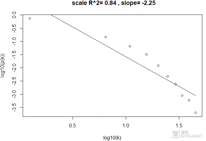
scaleFreePlot(k)
power=12确实也符合无尺度网络,R2较高
# >>> 2.3 计算gene在sample间的corr或者distance,构建临近矩阵。默认用dist函数计算(欧氏距离)
adj <- adjacency(exp,power = power)
# >>> 2.4 根据临近矩阵计算TOM(拓扑重叠矩阵)
TOM <- TOMsimilarity(adj)
# >>> 2.5 计算gene间相异性
dissTOM <- 1-TOM
# 3. 对gene进行聚类并可视化
geneTree <- hclust(as.dist(dissTOM),method = 'average')
sizeGrWindow(12,9)
plot(geneTree, xlab="", sub="", main = "Gene clustering on TOM-based dissimilarity",
labels = FALSE, hang = 0.04)
# >>> 3.2 将gene聚类树进行修剪后,把gene归到不同的模块里
dynamic_modules <- cutreeDynamic(dendro = geneTree,distM = dissTOM,minClusterSize = 50,
deepSplit = 2,pamRespectsDendro=F,minSplitHeight = NULL)
table(dynamic_modules)
module_color <- labels2colors(dynamic_modules)
plotDendroAndColors(geneTree,module_color,dendroLabels = F,hang=0.03,addGuide = T,
guideHang = 0.05,groupLabels='Dynamic color tree',
main='gene dendrogram and module colors')

# >>> 3.3 计算每个模块的特征基因向量(对每个模块的gene表达量降维后,只保留PC1,即MEs)
MEList <- moduleEigengenes(exp,colors = dynamic_modules)
MEs <- MEList$eigengenes
# >>> 3.4 计算特征基因的相异度,基于相异度对原有模块进行层次聚类
dissME <- 1-cor(MEs)
MEtree <- hclust(as.dist(dissME),method = 'average')
plotEigengeneNetworks(MEs,
"Eigengene adjacency heatmap",
marHeatmap = c(3,4,2,2),
plotDendrograms = FALSE,
xLabelsAngle = 90)
# >>> 3.5 如果模块太多,可以对模块进行合并.设置剪切高度,剪切高度以下的模块进行合并
cut_height <- 0.2
sizeGrWindow(8,6)
plot(MEtree,main = "Clustering of module eigengenes",
xlab = "", sub = "")
abline(h=cut_height,col='red')
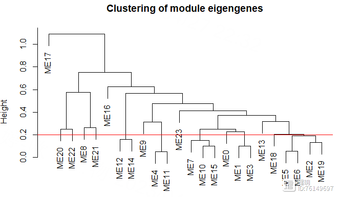
把高度0.2以下的模块进行合并,再看看合并前后模块的变化
module_merge <- mergeCloseModules(exp,module_color,cutHeight = cut_height)
merged_color <- module_merge$colors
merged_MEs <- module_merge$newMEs
sizeGrWindow(8,6)
plotDendroAndColors(geneTree,cbind(module_color,merged_color),dendroLabels = F,hang=0.03,
addGuide = T,groupLabels = c("Dynamic Tree Cut", "Merged dynamic"))

# 4. 计算每个模块与临床信息的相关性、pvalue。找出与临床信息相关性高的模块
nGenes <- ncol(exp)
nSamples <- nrow(exp)
################################准备临床信息####################################
clinical <- clinical[,c('bcr_patient_barcode','gender','residual_tumor')]
traits <- data.frame(row.names = rownames(exp),ID=rownames(exp))
traits$ID <- substr(traits$ID,1,12)
index <- match(traits$ID,clinical$bcr_patient_barcode)
traits$gender <- as.numeric(as.factor(clinical[index,'gender']))
traits$residual_tumor <- as.numeric(as.factor(clinical[index,'residual_tumor']))
traits$type <- ifelse(sapply(str_split(rownames(traits),'-',simplify = T)[,4],
function(x){as.integer(substr(x,1,2))})>=10,'normal','tumor')
traits$type <- as.numeric(as.factor(traits$type))
traits <- traits[,-1]
################################准备临床信息####################################
clinical是前面下载的TCGA临床数据,这里随便取了两个比较关心的临床信息。clinical的每一行是一个病人的ID,而表达矩阵每一行是一个样本,一个病人身上可能有多个样本。在把临床信息和表达矩阵一一对应的时候,如果直接把exp的行名取前12位,就会产生重复值。在做的时候,先准备好样本和病人ID的对应关系,再把clinical里病人的信息给匹配过来

最终的临床信息是这样,要把字符串变成数值型变量

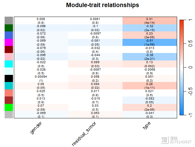
module_trait_cor <- cor(merged_MEs,traits,use = 'p')
module_trait_pvalue <- corPvalueStudent(module_trait_cor,nSamples)
trait_colors <- numbers2colors(traits,signed = T,centered = T)
a <- paste(signif(module_trait_cor, 2), "\n(", signif(module_trait_pvalue, 1), ")", sep = "")
sizeGrWindow(8,6)
labeledHeatmap(module_trait_cor,xLabels = colnames(traits),yLabels = colnames(merged_MEs),colorLabels = FALSE,
colors = blueWhiteRed(50),textMatrix = a,
setStdMargins = FALSE,cex.text = 0.65,zlim = c(-1,1),
main = paste("Module-trait relationships"))
模块与tumor/normal之间的相关性并不是很高。。。。。就拿粉色模块当做感兴趣的模块吧
# 5. 找出感兴趣的模块内的枢纽gene
# >>> 5.1 计算gene表达量与临床性状的相关性
gs <- apply(exp,2,function(x){cor(x,traits$type)})
# >>> 5.2 基于网络计算gene与临床性状的相关性
ns <- networkScreening(y=traits$type,datME = merged_MEs,datExpr = exp)
# >>> 5.3 计算每个gene与特征gene的相关性
kme <- signedKME(datExpr = exp,datME = merged_MEs)
# >>> 5.4 根据gs, ns, kme 找出hub gene
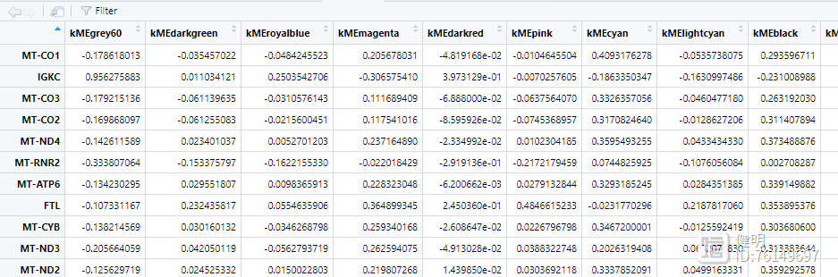
hubgene_filter <- (gs>0.2 & ns$q.Weighted<0.01 & abs(kme$kMEmagenta)>0.4)
hub_gene <- colnames(exp)[hubgene_filter]
plotNetworkHeatmap(exp,
plotGenes = hub_gene,
networkType = "unsigned",
useTOM = TRUE,
power=8,
main="unsigned correlations")
看下kme,其中粉色模块里,gene的相关性并不是很高,这里筛选了>0.4的,最后找到25个hub gene。如果阈值再设高一点,hub gene就全卡掉了。。。这跟没有用所有的3w多个gene去计算有关,也跟一些参数有关,我没有一个个去调整优化,只是展示一下如何做图和分析思路
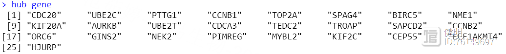
hub_gene <- intersect(hub_gene,deg$ID)
save(hub_gene,file = 'TCGA_WGCNA_hub_gene.Rdata')
最后找出hub gene和前面deg的交集部分,作为hub gene,存档
Step 4. 非负矩阵分解算法
4.1 NMF算法对样本分类
library(NMF)library(survival)
library(stringr)
library(data.table)
library(survminer)
library(dplyr)
library(AnnoProbe)
library(CIBERSORT)
library(tidyr)
library(tibble)
library(RColorBrewer)
library(ggalluvial)
library(ggplot2)
options(stringsAsFactors = F)
rm(list = ls())
gc()
load('TCGA_LUAD_TPM_exp.Rdata')
load('TCGA_DEGS.Rdata')
load('TCGA_WGCNA_hub_gene.Rdata')
dim(exp)
# 对表达矩阵取log2
exp <- log2(exp 1)
ranks <- seq(2,10)
hubgene_exp <- exp[hub_gene,]
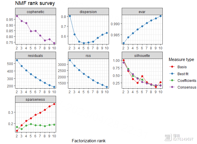
estimate <- nmf(hubgene_exp,2:10,nrun=50,method = 'brunet')
plot(estimate)
注意hubgene_exp里不能有负数,不然会报错,rank为2时,波动最大
rank <- 2
nmf.rank4 <- nmf(hubgene_exp,rank,nrun=50,method = 'brunet')
index <- extractFeatures(nmf.rank4,'max')
index <- unlist(index)
nmf.exp <- hubgene_exp[index,]
nmf.exp <- na.omit(nmf.exp)
group <- predict(nmf.rank4)
jco <- c("#2874C5","#EABF00","#C6524A","#868686")
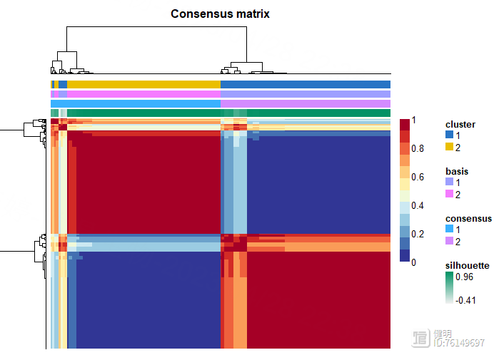
consensusmap(nmf.rank4,labRow=NA,labCol=NA,
annCol = data.frame("cluster"=group[colnames(nmf.exp)]),
annColors = list(cluster=c("1"=jco[1],"2"=jco[2],"3"=jco[3],"4"=jco[4])))
cluster_df <- data.frame(row.names = colnames(exp),ID=substr(colnames(exp),1,12),cluster=group)
NMF算法把所有样本分成两类,顺便看下最后的clueter_df
4.2 生存分析
load('TCGA_LUAD_TPM_exp.Rdata')load('TCGA_LUAD_Clinical.Rdata')
# 1. 取log(TPM)
for (i in 1:ncol(exp)){
exp[,i] <- log2(exp[,i] 0.0001)
}
# 2. 以病人为中心,去重
exp <- as.data.frame(exp)
exp <- exp[,sort(colnames(exp))]
index <- !duplicated(substr(colnames(exp),1,12))
exp <- exp[,index]
# 3.读取从xena下载的生存数据
sur <- fread('TCGA-LUAD.survival.tsv')
sur <- as.data.frame(sur)
patient_id <- substr(colnames(exp),1,12)
clin <- data.frame(row.names = patient_id,ID=patient_id)
index <- match(clin$ID,sur[,'_PATIENT'])
clin <- cbind(clin,sur[index,c('OS','OS.time')])
clin <- na.omit(clin)
index2 <- match(clin$ID,clinical$bcr_patient_barcode)
clin <- cbind(clin,clinical[index2,'gender'])
colnames(clin) <- c(colnames(clin)[1:ncol(clin)-1],'gender')
clin$gender <- as.numeric(as.factor(clin$gender))


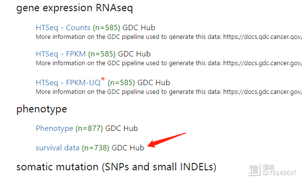
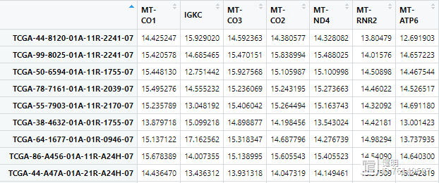
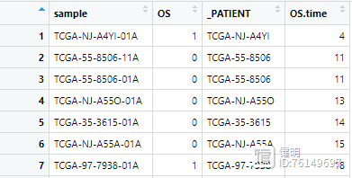
下载下来的生存数据长这样
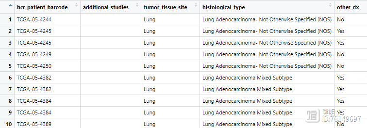
之前从TCGA下载的临床数据长这样
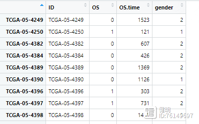
合并后的clin是这样,所有变量类型都要转成数值型
# 合并NMF结果
cluster_type_group <- ifelse(sapply(str_split(rownames(cluster_df),'-',simplify = T)[,4],
function(x){as.integer(substr(x,1,2))}
)>=10,
'normal','tumor')
cluster_df <- cluster_df[which(cluster_type_group=='tumor'),]
clin <- left_join(clin,cluster_df,'ID',multiple='first')
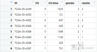
再把NMF分类的结果添加进来,就是cluster那一列
# 7. 过滤生存数据,不要<30天的,再把天数转换成月
clin <- clin[clin$OS.time>30,]
clin$OS.time <- clin$OS.time / 30
# 8. exp的列名和临床信息的行名一一对应。NMF将样本分成若干个亚型,画出亚型的生存曲线
colnames(exp) <- substr(colnames(exp),1,12)
index <- match(clin$ID,colnames(exp))
exp <- exp[,index]
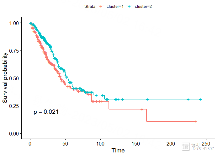
sfit <- survfit(Surv(OS.time,OS)~cluster,data=clin)
ggsurvplot(sfit,pval = T)
save(clin,file = 'clin.Rdata')
4.3 免疫浸润
my_pallet <- colorRampPalette(brewer.pal(8,'Set1'))lm22f = system.file("extdata", "LM22.txt", package = "CIBERSORT")
cluster1 <- exp[,rownames(cluster_df[cluster_df$cluster==1,])]
cluster2 <- exp[,rownames(cluster_df[cluster_df$cluster==2,])]
TME.result1 <- cibersort(lm22f,as.matrix(cluster1),perm = 100,QN=T) # 耗时很久
TME.result2 <- cibersort(lm22f,as.matrix(cluster2),perm = 100,QN=T)
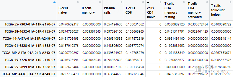
原文中免疫浸润用MCPcounter做的,这里我用CIBERSORT做,运行完的结果就是各种免疫细胞在每个样本中的含量
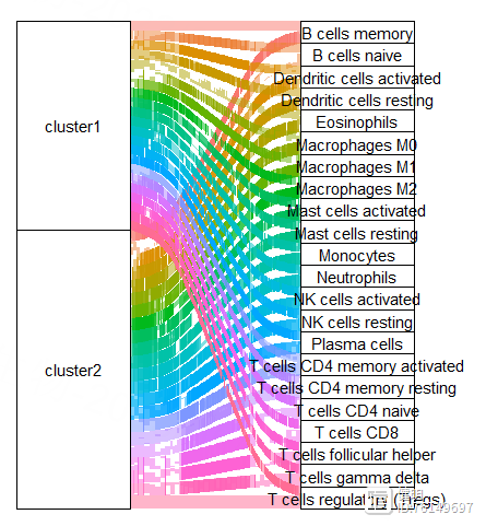
result1 <- TME.result1[,-c(23:25)] %>% as.data.frame() %>%
rownames_to_column('Sample') %>% gather(key = cell_type,value = proportion,-Sample)
result2 <- TME.result2[,-c(23:25)] %>% as.data.frame() %>%
rownames_to_column('Sample') %>% gather(key = cell_type,value = proportion,-Sample)
result1$cluster <- rep('cluster1', times=nrow(result1))
result2$cluster <- rep('cluster2', times=nrow(result2))
dat <- rbind(result1,result2)
ggplot(dat,aes(axis1 = cluster, axis2 = cell_type))
geom_alluvium(aes(fill = as.factor(cell_type)),width = 2/5, discern = FALSE)
geom_stratum(width = 2/5, discern = FALSE)
geom_text(stat = "stratum", discern = FALSE,aes(label = after_stat(stratum)))
theme(legend.position = "none",#去除刻度线和背景颜色
panel.background = element_blank(),
axis.ticks = element_blank(),
axis.text.y = element_blank(),
axis.text.x = element_text(size =15,colour = "black"),#坐标轴名
axis.title = element_blank())
scale_x_discrete(position = "top")
把上面的透视表转换成长表,添加上cluster的信息,再把cluster1和cluster2对应的长表合并起来,就可以画图了
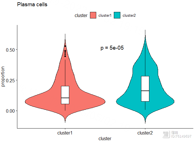
cell <- 'Plasma cells'
ggviolin(dat[dat$cell_type==cell,],x='cluster',y='proportion',fill = 'cluster',
add = 'boxplot',add.params = list(fill = 'white',width=0.1,linetype=1),title = cell)
stat_compare_means(method = 't.test',label = 'p.format',aes(label = 'p.format'),
label.x.npc = 'center',label.y = 0.5,size=5)
4.4 批量单因素Cox回归
load('TCGA_WGCNA_hub_gene.Rdata')load('TCGA_LUAD_TPM_exp.Rdata')
load('clin.Rdata')
hubgene_exp <- exp[hub_gene,]
hubgene_exp <- as.data.frame(t(hubgene_exp))
hubgene_exp$ID <- substr(rownames(hubgene_exp),1,12)
clin <- left_join(clin,hubgene_exp,by='ID')
把WGCNA中找到的hub gene挑出来,拿到他们在所有样本中的表达值。把表达值和生存信息合并到一起,最后的clin长这样。在合并之前要注意,删掉normal样本,我这里没有做。
res.cox <- coxph(Surv(OS.time,OS)~SAPCD2,data=clin)
sumres.cox <- summary(res.cox)
挑一个基因SAPCD2做单因素cox回归,最后需要的信息都藏在sumres.cox里
# 批量单因素cox回归
gene <- c()
p_value <- c()
HR <- c()
lower95 <- c()
upper95 <- c()
for (i in 6:ncol(clin)){
res <- coxph(Surv(OS.time,OS)~clin[,i],data=clin)
sum_res <- summary(res)
p <- sum_res$coefficients[,'Pr(>|z|)']
if (p<0.05){
gene <- c(gene,colnames(clin)[i])
p_value <- c(p_value,p)
HR <- c(HR,sum_res$conf.int[,'exp(coef)'])
lower95 <- c(lower95,sum_res$conf.int[,'lower .95'])
upper95 <- c(upper95,sum_res$conf.int[,'upper .95'])
}
}
cox_df <- data.frame(row.names = gene,pvalue=p_value,HR=HR,lower.95=lower95,upper.95=upper95)
lasso_input_gene <- rownames(cox_df[cox_df$pvalue<0.01,])
save(lasso_input_gene,file = 'Lasso_input_gene.Rdata')
批量单因素cox回归得到每个gene的pvalue,挑出pvalue<0.01的再进行后续筛选
Step 5. 预后模型构建和验证
load('Lasso_input_gene.Rdata')load('TCGA_LUAD_TPM_exp.Rdata')
load('clin.Rdata')
# 对表达矩阵取log2
exp <- log2(exp 0.00001)
exp <- as.data.frame(exp)
# Lasso回归进一步筛选gene
exp2 <- exp[lasso_input_gene,]
exp2 <- as.data.frame(t(exp2))
exp2$ID <- substr(rownames(exp2),1,12)
exp2 <- exp2[!duplicated(exp2$ID),]
clin <- clin[,1:3]
exp3 <- left_join(clin,exp2,by='ID')
rownames(exp3) <- exp3$ID
exp3 <- exp3[,-1]
exp3 <- na.omit(exp3)
exp3是生存数据和上一步批量单因素Cox回归筛选出来的基因的表达量合并起来的结果
x <- as.matrix(exp3[,3:(ncol(exp3)-1)])
y <- Surv(exp3$OS.time,exp3$OS)
fit1 <- glmnet(x,y,alpha = 1,family = 'cox')
plot(fit1)
cv_fit <- cv.glmnet(x,y,alpha = 1,nfolds = 10,family="cox")
plot(cv_fit)
best_lambda <- cv_fit$lambda.min
fit2 <- glmnet(x,y,lambda = best_lambda,alpha = 1,family = 'cox')
lasso_filter_gene <- names(fit2$beta[fit2$beta[,1]!=0,1])
由于之前筛选出来的gene效果不怎么好, 经过lasso过滤后,只剩2个gene了,就用这两个来做多因素cox回归
# 多因素cox回归构建预后模型
exp4 <- exp3 %>% dplyr::select(OS,OS.time,lasso_filter_gene)
multicox <- coxph(Surv(OS.time,OS)~.,data = exp4)
sum_multicox <- summary(multicox)
riskScore <- predict(multicox,type = 'risk',newdata = exp4)
riskScore <- as.data.frame(riskScore)
riskScore$ID <- rownames(riskScore)
riskScore$risk <- ifelse(riskScore$riskScore>median(riskScore$riskScore),'high','low')
做完多因素回归后,计算每个样本的riskscore,用riskScore把样本分成两类
# KM plot
km_data <- left_join(riskScore,clin,by='ID')
fit <- survfit(Surv(OS.time,OS)~risk,data=km_data)
ggsurvplot(fit,data = km_data,pval = T,risk.table = T,surv.median.line = 'hv',
legend.title = 'RiskScore',title = 'Overall survival',
ylab='Cummulative survival',xlab='Time(Days)')

# 绘制ROC曲线
roc_data <- data.frame(x = roc$FP[,1],
y = roc$TP[,1],
time = roc$times[1])
for (i in 2:length(roc$times)) {
temp <- data.frame(x = roc$FP[,i],
y = roc$TP[,i],
time = roc$times[i])
roc_data <- rbind(roc_data, temp)
}
ggplot(roc_data, aes(x = x, y = y, color = as.factor(time)))
geom_line()
scale_color_manual(values = c("gray", "blue", "black"))
geom_abline(slope = 1, intercept = 0, linetype = "dashed")
xlab("1 - Specificity")
ylab("Sensitivity")
ggtitle("ROC Curve")
theme_minimal()
# 绘制风险图
ggrisk(multicox)

# risk score与临床病理特征的相关性
load('TCGA_LUAD_Clinical.Rdata')
clinical_df <- clinical[,c('bcr_patient_barcode','gender','stage_event_pathologic_stage')]
clinical_df <- merge(km_data,clinical_df,by.x = 'ID',by.y = 'bcr_patient_barcode')
clinical_df <- clinical_df[!duplicated(clinical_df$ID),]
clinical_df$stage_event_pathologic_stage <- case_when(clinical_df$stage_event_pathologic_stage=='Stage IA'~'Stage I',
clinical_df$stage_event_pathologic_stage=='Stage IB'~'Stage I',
clinical_df$stage_event_pathologic_stage=='Stage IIA'~'Stage II',
clinical_df$stage_event_pathologic_stage=='Stage IIB'~'Stage II',
clinical_df$stage_event_pathologic_stage=='Stage IIIA'~'Stage III',
clinical_df$stage_event_pathologic_stage=='Stage IIIB'~'Stage III',
)
ggviolin(clinical_df,x='gender',y='riskScore',fill = 'gender',
add = 'boxplot',add.params = list(fill = 'white',width=0.1,linetype=1),)
stat_compare_means(method = 'wilcox.test',label = 'p.format',aes(label = 'p.format'),
label.x.npc = 'center',label.y = 20,size=5)
ggviolin(clinical_df,x='stage_event_pathologic_stage',y='riskScore',fill = 'stage_event_pathologic_stage',
add = 'boxplot',add.params = list(fill = 'white',width=0.1,linetype=1),)
stat_compare_means(method = 'wilcox.test',label = 'p.signif',aes(label = 'p.format'),
label.x = 1,label.y = 20,size=5)

Step 6. riskScore和临床信息的相关性
# 森林图# 批量单因素回归
df_forest <- clinical_df
df_forest$gender <- as.numeric(as.factor(df_forest$gender))
df_forest$stage_event_pathologic_stage <- as.numeric(as.factor(df_forest$stage_event_pathologic_stage))
gene <- c()
p_value <- c()
HR <- c()
lower95 <- c()
upper95 <- c()
means <- c()
for (i in c('riskScore','gender','stage_event_pathologic_stage')){
res <- coxph(Surv(OS.time,OS)~df_forest[,i],data=df_forest)
sum_res <- summary(res)
p <- sum_res$coefficients[,'Pr(>|z|)']
gene <- c(gene,i)
p_value <- c(p_value,p)
HR <- c(HR,sum_res$conf.int[,'exp(coef)'])
lower95 <- c(lower95,sum_res$conf.int[,'lower .95'])
upper95 <- c(upper95,sum_res$conf.int[,'upper .95'])
means <- c(means,res$means)
}
cox_df <- data.frame(row.names = gene,pvalue=p_value,HR=HR,lower.95=lower95,upper.95=upper95,means=means)
cox_df$pvalue <- round(cox_df$pvalue,3)
cox_df$HR <- round(cox_df$HR,3)
cox_df <- rownames_to_column(cox_df,var = 'Variable')
cox_df <- rbind(colnames(cox_df),cox_df)
forestplot(labeltext=as.matrix(cox_df)[,1:3],lower=as.numeric(cox_df[,4]),
upper=as.numeric(cox_df[,5]),mean=as.numeric(cox_df[,6]),
is.summary=c(T,F,F,F),
zero=0,lineheight=unit(0.5,'cm'),graphwidth=unit(35,'mm'),
colgap=unit(2,'mm'),lwd.zero=2,lwd.ci=3,
col=fpColors(box = '#7AC5CD',lines = 'black',zero = 'purple'),
lwd.xaxis=2,lty.ci='solid',ci.vertices.height=0.05,graph.pos=2,
xlim=c(0,2.5),box.size=0.5,
hrzl_lines=list('2'=gpar(lwd=3,columns=1:4,col='dark green'),
'5'=gpar(lwd=3,columns=1:4,col='dark green'))
)
# 多因素回归
res <- coxph(Surv(OS.time,OS)~riskScore gender stage_event_pathologic_stage,data=df_forest)
sum_res <- summary(res)
df <- data.frame(row.names = rownames(sum_res$conf.int),pvalue=sum_res$coefficients[,'Pr(>|z|)'],
HR=sum_res$conf.int[,'exp(coef)'],lower=sum_res$conf.int[,'lower .95'],
upper=sum_res$conf.int[,'upper .95'],means=res$means)
df$pvalue <- round(df$pvalue,3)
df$HR <- round(df$HR,3)
df <- rownames_to_column(df,var='Variable')
df <- rbind(colnames(df),df)
forestplot(labeltext=as.matrix(df)[,1:3],lower=as.numeric(df[,4]),
upper=as.numeric(df[,5]),mean=as.numeric(df[,6]),
is.summary=c(T,F,F,F),
zero=0,lineheight=unit(0.5,'cm'),graphwidth=unit(35,'mm'),
colgap=unit(2,'mm'),lwd.zero=2,lwd.ci=3,
col=fpColors(box = '#7AC5CD',lines = 'black',zero = 'purple'),
lwd.xaxis=2,lty.ci='solid',ci.vertices.height=0.05,graph.pos=2,
xlim=c(0,2.5),box.size=0.5,
hrzl_lines=list('2'=gpar(lwd=3,columns=1:4,col='dark green'),
'5'=gpar(lwd=3,columns=1:4,col='dark green'))
)

# GSEA
df_exp <- as.data.frame(t(exp))
df_exp <- rownames_to_column(df_exp,var = 'sample_ID')
df_exp$sample_ID <- substr(df_exp$sample_ID,1,12)
df_exp <- df_exp[!duplicated(df_exp$sample_ID),]
rownames(df_exp) <- df_exp$sample_ID
df_exp <- as.data.frame(t(df_exp[,-1]))
df_exp <- df_exp[,km_data$ID]
group <- as.factor(km_data$risk)
design <- model.matrix(~km_data$risk)
fit <- lmFit(df_exp,design)
fit <- eBayes(fit)
df_deg <- topTable(fit,coef = 2,number = Inf)
df_deg$change <- ifelse(df_deg$logFC>log2(2) & df_deg$adj.P.Val<0.05,'up',
ifelse(df_deg$logFC<log2(0.5) & df_deg$adj.P.Val<0.05,'down','nochange'))
df_deg <- df_deg[order(df_deg$logFC,decreasing = T),]
symbol_2_entrez <- bitr(rownames(df_deg),fromType = 'SYMBOL',toType = 'ENTREZID',OrgDb = org.Hs.eg.db)
symbol_2_entrez <- symbol_2_entrez[!duplicated(symbol_2_entrez$SYMBOL),]
rownames(symbol_2_entrez) <- symbol_2_entrez$SYMBOL
df_deg$entrezid <- symbol_2_entrez[rownames(df_deg),'ENTREZID']
df_deg <- df_deg[!duplicated(df_deg$entrezid),]
df_deg <- na.omit(df_deg)
a <- df_deg[(df_deg$change=='up'),'logFC']
names(a) <- df_deg[(df_deg$change=='up'),'entrezid']
res_a <- gseKEGG(a,'hsa')
b <- df_deg[(df_deg$change=='down'),'logFC']
names(b) <- df_deg[(df_deg$change=='down'),'entrezid']
res_b <- gseKEGG(b,'hsa')
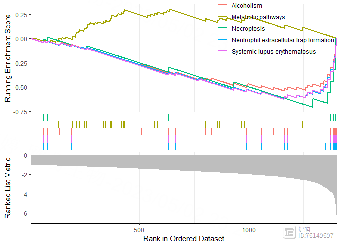
gseaplot2(res_a,geneSetID = 1:5)
gseaplot2(res_b,geneSetID = 1:5)
先做差异分析,找到high risk vs low risk的差异基因,上调和下调的gene分别拿去做GSEA再画图
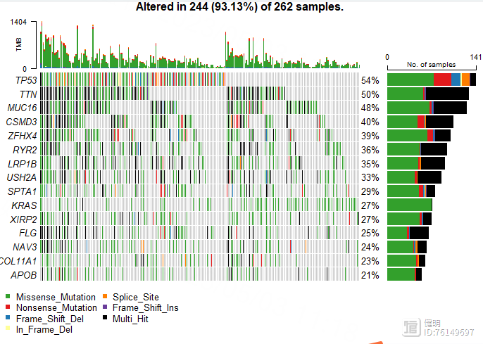
# waterfall plot
query <- GDCquery(project = 'TCGA-LUAD',
data.category = "Simple Nucleotide Variation",
data.type = "Masked Somatic Mutation",
access = 'open')
GDCdownload(query)
GDCprepare(query,save = T,save.filename = 'TCGA-LUAD-SNP.Rdata')
load('TCGA-LUAD-SNP.Rdata')
luad_snp <- read.maf(maf=data)
plotmafSummary(luad_snp,rmOutlier = TRUE, addStat = 'median', dashboard = TRUE, titvRaw = FALSE)
oncoplot(luad_snp,top = 15)
Step 7. 高低风险组间的免疫浸润
library(GSVA)library(GSEABase)
library(ggplot2)
library(tidyr)
rm(list = ls())
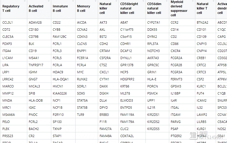
#1. 获取geneSets
# 下载28种免疫细胞的参考基因集 </TISIDB/data/download/CellReports.txt>
geneSet <- read.csv("cellReport.txt",header = F,sep = "\t",)
geneSet[1:5,1:5]
geneSet <- t(tibble::column_to_rownames(geneSet,var = 'V1'))
gene_list <- list()
for (i in colnames(geneSet)){
gene_list[[i]] <- geneSet[,i]
gene_list[[i]] <-gene_list[[i]][gene_list[[i]]!='']
}
直接读取的geneSet长这样,有空值,需要转变成gene_list,list长度为28,其中每个元素是某个细胞所有基因的向量,名字是对应的细胞
# 载入表达矩阵,把表达矩阵分成high risk 和low risk组
load('TCGA_LUAD_TPM_exp.Rdata')
load('risk.Rdata')
# 对表达矩阵取log2
exp <- log2(exp 0.00001)
exp <- as.data.frame(exp)
colnames(exp) <- substr(colnames(exp),1,12)
exp <- exp[,!duplicated(colnames(exp))]
high_risk_sample <- km_data[km_data$risk=='high','ID']
low_risk_sample <- km_data[km_data$risk=='low','ID']
high_risk_exp <- exp[,high_risk_sample]
low_risk_exp <- exp[,low_risk_sample]
# ssGSEA
high_risk_gsea <- gsva(high_risk_exp,gene_list,method='ssgsea',kcdf='Gaussian',abs.ranking=T)
low_risk_gsea <- gsva(low_risk_exp,gene_list,method='ssgsea',kcdf='Gaussian',abs.ranking=T)
要注意gsva函数的输入得是matrix,不能是data.frame,不然会报错
hr_gsea_norm <- high_risk_gsea
for (i in colnames(hr_gsea_norm)) {
diff <- max(hr_gsea_norm[,i] )-min(hr_gsea_norm[,i] )
hr_gsea_norm[,i] <- (hr_gsea_norm[,i] -min(hr_gsea_norm[,i]))/diff
}
hr_gsea_norm <- as.data.frame(t(hr_gsea_norm))
hr_gsea_norm$type <- rep('high',times=nrow(hr_gsea_norm))
lr_gsea_norm <- low_risk_gsea
for (i in colnames(lr_gsea_norm)) {
diff <- max(lr_gsea_norm[,i] )-min(lr_gsea_norm[,i])
lr_gsea_norm[,i] <- (lr_gsea_norm[,i] -min(lr_gsea_norm[,i]))/diff
}
lr_gsea_norm <- as.data.frame(t(lr_gsea_norm))
lr_gsea_norm$type <- rep('low',times=nrow(lr_gsea_norm))
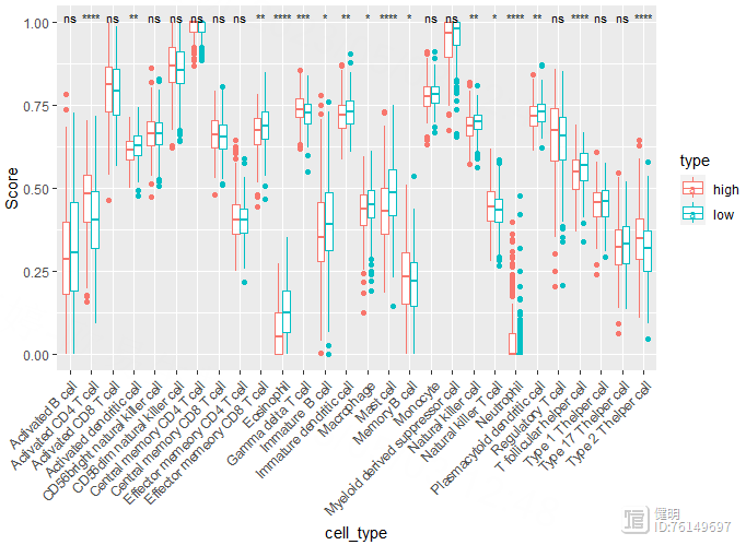
gsea_norm <- rbind(hr_gsea_norm,lr_gsea_norm)
longer <- pivot_longer(gsea_norm,cols = !type,names_to = 'cell_type',values_to = 'Score')
ggplot(longer,aes(x=cell_type,y=Score,color=type)) geom_boxplot()
theme(axis.text.x = element_text(angle = 45,hjust = 1))
stat_compare_means(label = "p.signif",size=3,method = 'wilcox.test')
先把high risk gsea和low risk gsea的数据分别进行min max scale,新增一列标记上high和low,然后合并起来,行是样本,列是细胞。再把透视表转成长表,就可以画图了
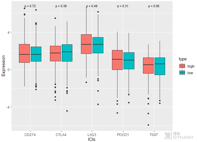
# 免疫检查点&TBM
risk_exp <- as.data.frame(t(exp))
risk_exp <- risk_exp[km_data$ID,]
risk_exp$type <- km_data$risk
risk_exp <- risk_exp[,c('CD274','PDCD1','CTLA4','LAG3','TIGIT','type')]
risk_long <- pivot_longer(risk_exp,cols = !type,names_to = 'ICIs',values_to = 'Expression')
ggplot(risk_long,aes(x=ICIs,y=Expression,fill=type)) geom_boxplot()
stat_compare_means(label = "p.format",size=3,method = 'wilcox.test')
文末友情宣传
强烈建议你推荐给身边的博士后以及年轻生物学PI,多一点数据认知,让他们的科研上一个台阶:
生物信息学马拉松授课(买一得五) ,你的生物信息学入门课144线程640Gb内存服务器共享一年仍然是仅需800千呼万唤始出来的独享生物信息学云服务器
在ps中锐化工具的使用方法及锐化工具的用途?
在PS中,锐化工具位于工具栏中的模糊工具下方,它的图标是一个带有三角形的圆圈。使用锐化工具可以增强图像的清晰度和细节,使图像看起来更加锐利。使用锐化工具的方法如下:打开需要处理的图像。选择锐化工具。调整工具选项栏中的参数,包括笔刷大小、强度和阈值等。在需要锐化的区域上单击并拖动鼠标,直到达到期望的效果。锐化工具的用途包括:增强图像的清晰度和细节,使图像看起来更加锐利。站长网2023-07-27 16:42:050004PS教材中播放预设的动作
站长网2023-07-27 13:11:310000微信一口气更新了6个功能,我只想说:这也太......
Hello,各位叨友们好呀!我是叨叨君~微信最近虽然没有进行版本更新,但却悄悄做了一些改变,不得不说新变化还是有些看头的,接下来就让我们一起来看看都有哪些变化吧!1、查看名片想要知道自己在某个商家总共消费了多少钱?可以在微信支付对话框【查看名片】中查看付款记录。2、导出个人信息微信8.0.16版本,目前已支持导出个人信息,包括昵称、头像等。站长网2023-07-28 09:46:250000在PS教材中,可选颜色命令可以让用户选择颜色并将其应用于图像中的对象或文本.
站长网2023-07-27 11:35:400000手机绑定银行卡,建议打开这2个开关,让资金更安全,去试试吧
站长网2023-07-30 13:30:490000